
Why a Social Media Marketing Growth Agency Delivers Better ROI

Understanding ROI in Social Media Marketing Return on Investment (ROI) in the context of social media marketing is a critical measure that helps businesses evaluate the effectiveness of their campaigns. ROI is fundamentally the ratio between the net profit and the cost of an investment, expressed as a percentage. This calculation assists organizations in determining the profitability of their marketing initiatives. In the case of social media, ROI encompasses various metrics, including engagement, conversion rates, and overall sales attributed to promotional efforts on platforms such as Facebook, Twitter, and Instagram. To calculate the ROI, businesses may adopt the formula: ROI = (Net Profit / Cost of Investment) x 100. For instance, if a company spends $1,000 on a social media advertising campaign and generates $5,000 in revenue, the net profit is $4,000. Applying the formula results in an ROI of 400%, indicating that for every dollar spent, the return was four dollars. Such high ROI can be considered a sign of a successful social media marketing strategy. Conversely, a poor ROI would signal inefficiency and potential setbacks for the business. For example, if the same company invested $1,000 but only generated $1,500, the ROI would be 50%. This indicates a limited return in relation to the costs incurred, signifying the need for a reevaluation of strategies deployed in the marketing campaign. A graduate understanding of ROI not only reveals the actual performance of specific campaigns but also aids in aligning future investments with overall business goals. Businesses seeking to bolster their marketing effectiveness must prioritize analyzing their ROI consistently to ensure they remain competitive and optimize their social media efforts. The Role of Social Media Marketing Growth Agencies In today’s digital landscape, social media marketing growth agencies play a pivotal role in enhancing brand visibility and engagement. These agencies specialize in developing comprehensive growth strategies that are tailored to meet the specific needs and goals of each client. One of the primary functions of these agencies is strategic planning. They begin by assessing a brand’s current position in the market, identifying target audiences, and determining the most effective social media platforms to utilize. Through this thorough analysis, agencies can craft strategies that focus on driving measurable results. Content creation is another critical capability of social media marketing growth agencies. They work with skilled content creators to develop engaging and relevant content that resonates with audiences. This includes creating visually appealing graphics, informative posts, and compelling videos that align with the brand’s messaging. By consistently delivering high-quality content, these agencies help brands maintain an active presence on social media and foster increased engagement rates. Community management also stands at the forefront of their services. By interacting with followers, responding to comments, and managing online conversations, agencies help brands establish a loyal community around their products or services. This active engagement not only strengthens brand loyalty but also encourages organic growth through word-of-mouth referrals. Lastly, data analysis is crucial for measuring the success of any social media campaign. Growth agencies utilize advanced analytics tools to track performance metrics, evaluate the effectiveness of different strategies, and gain insights into consumer behavior. This data-driven approach allows them to make informed decisions and refine strategies in real time, ensuring ongoing improvement in ROI. Expertise and Tools for Better Outcomes In the fast-evolving landscape of social media, the competitive advantage provided by a dedicated social media marketing growth agency is significant. One of the foremost elements that contribute to this advantage is their access to advanced tools and deep-seated expertise. These agencies leverage a suite of critical technologies designed to enhance campaign effectiveness and drive higher returns on investment (ROI). Analytics platforms play a pivotal role in the decision-making and strategic planning of social media marketing campaigns. These tools provide comprehensive insights into audience behavior, engagement metrics, and overall campaign performance. By harnessing this data, agencies can refine their strategies, tailor their content to resonate with specific demographics, and maximize engagement rates. The ability to track and analyze performance in real-time allows them to make informed adjustments, thereby optimizing campaigns for better results. Furthermore, scheduling tools are essential in ensuring timely and consistent content delivery across various social media platforms. The strategic dissemination of content not only helps maintain audience interest but also ensures that posts reach users at peak engagement times. This capability is particularly valuable in a world where timing can significantly affect a post’s visibility and engagement. Content management systems (CMS) are another crucial resource utilized by social media marketing growth agencies. These systems enable efficient content creation, curation, and distribution, allowing agencies to manage multiple campaigns concurrently without sacrificing quality. By deploying systematic content strategies backed by robust tools, agencies can also ensure that messaging remains coherent across all platforms. In conclusion, the combination of expertise and advanced tools provided by social media marketing growth agencies is instrumental in achieving superior outcomes. These resources facilitate better audience targeting and performance tracking, ultimately leading to enhanced ROI for businesses looking to strengthen their online presence. Tailored Strategies to Drive Growth In today’s competitive landscape, a one-size-fits-all approach to social media marketing often fails to achieve the desired results. A social media marketing growth agency excels in creating tailored strategies that align with the unique goals of each business. These agencies thoroughly analyze individual business objectives, taking into consideration the specific nuances of the target audience, which is paramount for effective engagement. Customized strategies begin with a comprehensive target audience analysis. By understanding demographics, interests, and behaviors, social media marketing growth agencies can craft messages that resonate with potential customers. This level of personalization enhances the likelihood of engagement, as campaigns are specifically designed to appeal to the values and preferences of the audience. Tailored content not only captures attention but also drives conversation and interaction, critical metrics in determining the success of social media initiatives. Additionally, market trend analysis plays a significant role in developing impactful strategies. By staying informed on current trends and shifting consumer behaviors, agencies can pivot their campaigns
How to Turn LinkedIn Into a Consistent Lead Generation Channel
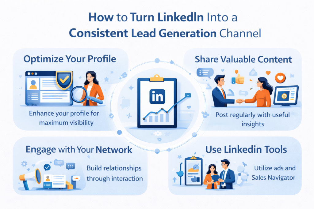
LinkedIn is increasingly recognized as a powerful lead generation tool, uniquely positioned among social media platforms due to its professional user base. Unlike other platforms that cater primarily to personal interactions or casual content sharing, LinkedIn serves as a dedicated space for business professionals, creating an environment that fosters meaningful connections and interactions. As a result, users find themselves surrounded by prospective clients, partners, and industry influencers, facilitating relationship building that can ultimately translate into business opportunities. One significant advantage of LinkedIn is its extensive networking capabilities. Users can connect with other professionals, join industry-specific groups, and participate in discussions that reflect their expertise. This fundamental characteristic allows businesses to not only showcase their services but also engage in dialogue with potential leads, adding value through insightful contributions. The interactions on LinkedIn tend to be more focused and purposeful compared to more casual platforms, making it easier for users to identify and approach potential clients. LinkedIn also offers an array of tools designed to enhance business interactions. Features such as LinkedIn Sales Navigator, InMail, and targeted content sharing help refine outreach strategies, ensuring that businesses can effectively reach the right audience. The data-driven insights available through these tools allow businesses to gauge engagement and optimize their lead generation efforts accordingly. Moreover, the ability to utilize advanced search filters to target decision-makers further solidifies LinkedIn’s reputation as a leading platform for professional networking and lead generation. In contrast to other social media channels where the focus may be on brand awareness or entertainment, LinkedIn’s concentration on B2B connections and professional content positions it as a more effective platform for targeted lead generation. With these unique qualities, LinkedIn proves to be an essential tool for businesses striving to cultivate lasting relationships and secure quality leads in today’s competitive marketplace. Optimizing Your LinkedIn Profile for Lead Generation To transform your LinkedIn profile into an effective channel for lead generation, it is crucial to focus on several key elements. A well-optimized profile not only highlights your expertise but also attracts potential leads through strategic presentation. First and foremost, your headline should be compelling and reflective of your professional identity. It serves as the first impression for visitors and should convey your value proposition succinctly. Rather than merely stating your job title, consider incorporating keywords related to your niche that potential leads might use in their searches. This simple adjustment can significantly enhance your visibility within the platform. Another essential component is your summary. This section should not be a mere rehash of your resume; instead, it should tell a story about your professional journey, showcasing your accomplishments and what you can offer to clients or collaborators. Aim for a concise narrative that encapsulates your passion, your skills, and your unique selling points. Utilize bullet points or brief paragraphs for better readability, helping potential leads to digest your information quickly. Your profile photo is equally important. A clear, professional photograph fosters trust and credibility. Opt for an image where you are dressed appropriately for your industry, projecting a positive and approachable demeanor. After all, first impressions are crucial in establishing connections with potential leads. Lastly, showcase relevant skills effectively. LinkedIn allows you to list several competencies. Prioritize skills that are directly related to the services you offer, reflecting your qualifications truthfully. This not only enhances your profile’s completeness but also makes it easier for leads to identify your areas of expertise. An optimized LinkedIn profile is instrumental in your lead generation efforts, allowing you to engage with your target audience effectively. By focusing on these key profile elements, you create a platform that highlights your skills and showcases your professional identity, reinforcing your credibility and appeal to potential clients. Building a Targeted Connections Network In today’s digital landscape, building a targeted connections network on LinkedIn is paramount for effective lead generation. The primary objective is to connect with professionals who are within your target audience—those who can benefit from your offerings or those who might be in a position to provide valuable referrals. To start expanding your network intentionally, one must first identify the ideal connections that align with your business objectives. Identifying your target audience can be achieved through a multi-step process. Begin by defining your buyer persona, which encompasses the demographic, professional, and psychographic characteristics of your ideal client. Use LinkedIn’s advanced search features to filter potential connections based on criteria such as industry, job title, location, and mutual connections. By honing in on these specifics, you can create a list of individuals who align closely with your target market. Once you have compiled a target list, the next step is to personalize your connection requests. This process is crucial for increasing acceptance rates, as a generic request is often overlooked or declined. Take the time to include a brief, meaningful message explaining why you wish to connect. Reference common connections or shared interests, and express how connecting could be mutually beneficial. This practice not only demonstrates genuine interest but also sets a positive tone for future interactions. Moreover, consider engaging with your target connections’ content before sending connection requests. Liking, commenting, or sharing their posts can create familiarity and increase the likelihood of them accepting your invitation. Building a targeted connections network requires a strategic approach focused on quality over quantity. By connecting with individuals who are directly relevant to your business goals, you establish a foundation for meaningful professional relationships that can enhance your lead generation efforts over time. Engaging with Your Network Through Strategic Content Sharing Effective engagement on LinkedIn hinges on the strategic sharing of content that resonates with your network while establishing your authority as a thought leader. To achieve this, it is essential to curate and create a diverse range of content that serves not only your interests but also aligns with the needs and expectations of your connections. One effective strategy for engaging your network is sharing insightful articles. By selecting industry-relevant pieces, you can provide value to your connections. Consider adding a personal touch
Mistakes Businesses Make Without Professional LinkedIn Marketing
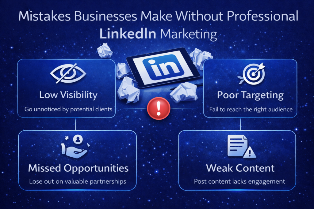
Introduction to LinkedIn Marketing In the ever-evolving landscape of digital marketing, LinkedIn has emerged as a critical platform for businesses and professionals seeking to enhance their brand visibility and foster meaningful connections. LinkedIn marketing entails leveraging the platform’s unique features to engage with a targeted audience by sharing valuable content, building professional relationships, and generating leads. This approach is essential for businesses that aim to establish a robust online presence and capitalize on the opportunities available within the professional realm. LinkedIn serves as a hub for over 800 million professionals, making it an unparalleled network for B2B interactions. Its focus on professionalism differentiates it from other social media platforms, offering businesses the chance to connect with industry leaders, potential clients, and like-minded professionals. Through strategic marketing efforts on LinkedIn, companies can not only showcase their services and expertise but also enhance their credibility within their respective industries. Furthermore, the significance of LinkedIn marketing lies in its ability to facilitate effective networking. By engaging with peers and industry influencers, businesses can nurture relationships that may lead to partnerships and new opportunities. This platform also enables companies to share insightful content, such as articles and presentations, that position them as thought leaders and attract a wider audience interested in their niche. Ultimately, harnessing the power of LinkedIn for marketing purposes plays an integral role in establishing a professional brand identity. By utilizing LinkedIn’s capabilities effectively, businesses can create a strong foundation for lead generation and sustained engagement, making it an invaluable resource in their marketing strategy. Overlooking Target Audience Identification In today’s digital landscape, the significance of identifying and understanding a target audience on LinkedIn cannot be overstated. Many businesses tend to overlook this crucial aspect of their marketing strategy, thus failing to tailor their outreach appropriately. Without a clear understanding of who their audience is, companies often resort to generic marketing tactics that lack the personalization needed to resonate with potential clients or partners. Effective LinkedIn marketing relies heavily on the ability to segment audiences by demographics, industries, job roles, and interests. For instance, a technology startup may find a distinct audience in CIOs and IT managers across sectors, while a consulting firm may need to reach decision-makers in finance or healthcare. The absence of this focused approach leads to wasted resources and missed opportunities for engagement. Furthermore, understanding the target audience also involves recognizing their pain points and interests. Businesses that spend time assessing their audience’s challenges are better positioned to develop content that speaks directly to those issues. This not only enhances the relevancy of their marketing initiatives but also strengthens the overall brand image as a thought leader within the industry. When companies fail to segment and analyze their audience correctly, they risk delivering messages that do not align with the needs and expectations of their potential clients. To avoid these common pitfalls, businesses should invest in market research tools and data analytics to gain insights into their audience’s behaviors and preferences. By doing so, they set the foundation for a more effective LinkedIn marketing strategy that not only reaches the right people but also engages them meaningfully, ultimately converting interactions into tangible business outcomes. Neglecting Profile Optimization In the realm of LinkedIn marketing, profile optimization is often overlooked by businesses, leading to missed opportunities for engagement and visibility. A well-crafted LinkedIn profile serves not only as a digital business card but also as a comprehensive marketing tool. To maximize its effectiveness, businesses should prioritize essential elements such as headlines, summaries, and images. The headline, for instance, is the first thing users notice when they visit a profile. It should be concise, compelling, and optimized with keywords that reflect the business’s core services or industry. By doing so, companies can ensure that they appear in relevant searches, attracting potential clients and partners. However, many businesses fail to utilize this space to its full potential, often opting for generic titles that do not resonate with their target audience. Equally important is the summary section, which provides an opportunity to articulate the brand’s story, values, and expertise. A well-written summary should not only include relevant keywords but also engage the reader with a clear narrative that highlights the unique selling propositions of the business. Unfortunately, many organizations neglect to create a compelling summary, resulting in profiles that lack depth and fail to capture interest. Additionally, profile images and banners contribute significantly to first impressions. A professional appearance is essential; this includes using high-quality images that reflect the brand identity. The lack of visual appeal can deter potential connections, as users are likely to question the credibility of a profile that appears unprofessional or uninviting. By investing time in optimizing these critical elements, businesses can enhance their profiles significantly. In conclusion, neglecting LinkedIn profile optimization can hinder a business’s ability to connect with its audience effectively. By focusing on headlines, summaries, and visuals, organizations can improve their visibility and foster meaningful connections that drive growth. Valuable Content for LinkedIn Audiences One of the most critical mistakes businesses make on LinkedIn is the failure to share valuable, relevant content. In the digital landscape where attention spans are fleeting, providing content that resonates with your audience is essential for fostering engagement and building brand authority. Content on LinkedIn should aim to inform, educate, or inspire. This could include industry insights, thought leadership articles, white papers, and engaging posts that encourage discussion. Furthermore, businesses must recognize the diversity of their audience on LinkedIn. Different types of professional content can appeal to various segments of the audience. For instance, video content can effectively convey messages and engage viewers more dynamically when compared to traditional text-based posts. Infographics, webinars, and case studies can also serve as powerful tools for demonstrating expertise and sharing knowledge that speaks to professionals in various fields. Neglecting to post valuable content not only risks disengagement but can also lead to missed opportunities for building connections and partnerships. Audience members who find your content uninspiring or irrelevant are less likely to
Why LinkedIn Marketing Services Are Better Than Paid Ads Alone
Introduction to LinkedIn Marketing LinkedIn has emerged as a pivotal platform for professional networking, playing a significant role in shaping the business landscape. With over 875 million members worldwide, LinkedIn stands out as the foremost social network for professionals, where individuals and organizations can connect, share insights, and promote their services. Its unique positioning as a professional platform sets it apart from other social media channels that largely focus on personal interactions. This feature makes LinkedIn an invaluable resource for businesses looking to establish a credible presence and generate leads. Leveraging LinkedIn marketing services presents distinct advantages over traditional paid advertising methods. Unlike typical ads that reach a broad audience regardless of contextual relevance, LinkedIn allows businesses to target their desired demographic precisely. The platform’s tools enable users to refine their audience based on criteria such as industry, company size, job title, and professional interests. This targeted approach not only enhances the relevance of marketing messages but also improves the overall effectiveness of campaigns. Furthermore, LinkedIn marketing fosters the development of thought leadership and brand authority. By sharing valuable content—ranging from informative articles to engaging posts—businesses can position themselves as experts in their field. This strategy not only attracts potential clients but also nurtures existing relationships, fostering trust and credibility in the process. The growing trend of B2B marketing on LinkedIn indicates that businesses increasingly recognize the platform’s potential to streamline lead generation and customer engagement. Understanding Paid Ads: The Basics Paid advertising is a key component of digital marketing, allowing businesses to promote their products and services to targeted audiences across various platforms. These ads generally function on a pay-per-click (PPC) model, where advertisers are charged each time a user clicks on their advertisement. Some prominent platforms for paid ads include Google Ads, Facebook Ads, and Instagram Ads. Each of these platforms offers unique targeting capabilities, enabling marketers to hone in on demographic, geographic, and psychographic segments of the population. Google Ads, for instance, allows businesses to appear in search engine results whenever users search for specific keywords. This can drive significant traffic to a website, especially when the chosen keywords align with high intent queries. The performance metrics for Google Ads typically include click-through rates (CTR), cost-per-click (CPC), and conversion rates, which indicate the effectiveness of the campaign in achieving its advertising objectives. On the other hand, Facebook Ads leverage the vast data accumulated by the platform to guide advertisers in targeting potential customers based on users’ interests, behaviors, and demographic information. Performance metrics here often include engagement rates, reach, and impressions, as well as conversion metrics for specific goals set by advertisers. Despite the benefits of paid advertising, businesses often encounter challenges that can hinder the effectiveness of their campaigns. High competition can drive up costs, particularly in popular sectors, while ad fatigue may occur when audiences are repeatedly exposed to the same advertisements. Additionally, the accuracy of tracking user interactions and conversions can sometimes be questionable, leading to challenges in assessing the true ROI of ad spend. Understanding these fundamentals of paid ads is essential for businesses looking to optimize their marketing strategies. The Advantages of LinkedIn Marketing Services LinkedIn marketing services present a multitude of advantages that distinguish them from paid advertising strategies. One of the primary benefits is the ability to access a highly targeted audience. LinkedIn is uniquely positioned as a professional networking platform, attracting individuals actively seeking business connections, professional development, and industry-specific content. This specificity allows businesses to hone in on their ideal customers with unparalleled precision, optimizing marketing efforts toward segments most likely to engage. In contrast, paid ads often cast a wider net, resulting in lower engagement rates and less conversion potential. Moreover, utilizing LinkedIn marketing services inherently improves brand credibility. By establishing a robust brand presence on LinkedIn, businesses can showcase their expertise through thought leadership articles, engaging posts, and participation in professional groups. This interactive approach not only strengthens brand recognition but also cultivates trust within the industry. When potential clients encounter your brand’s consistent and insightful contributions, they are more inclined to view it as a credible source. This heightened credibility is crucial in a marketplace where trust plays a significant role in the decision-making process. Additionally, LinkedIn marketing fosters opportunities for meaningful engagement. Unlike traditional ads that often interrupt the user experience, LinkedIn allows brands to create conversations around their content. This interactivity leads to deeper relationships with prospects and the community. Participating in group discussions, responding to comments, and sharing valuable insights can enhance user engagement, ultimately driving higher conversion rates. These interactions often lead to more qualified leads, as they indicate a greater level of interest and pertinence compared to individuals who may have simply clicked on a paid advertisement. Targeting the Right Audience on LinkedIn LinkedIn provides a suite of advanced targeting options which empower marketers to efficiently reach their ideal audience. This platform is specifically engineered to facilitate professional networking, making it an invaluable asset for businesses seeking to market their products and services effectively. One of the standout features is industry segmentation, which allows marketers to focus their campaigns on specific sectors. This precision helps ensure that messages resonate with the right professionals, thereby increasing engagement rates. In addition to industry segmentation, role-based targeting enables the selection of individuals based on their job title, function, or level within an organization. This feature proves particularly advantageous when promoting products or services that cater to specific professional needs or decision-making levels. For example, marketing software may be promoted directly to marketing managers or directors, thereby enhancing both relevance and likelihood of conversion. Geographical filters further refine targeting capabilities, allowing marketers to focus on particular regions, countries, or cities. This feature is crucial for businesses with location-specific offers or those aiming to establish a presence in a new market. The combination of these targeting options contributes to higher conversion rates as companies can align their campaigns with the demographics that matter most. Moreover, statistics indicate that businesses leveraging LinkedIn’s targeting features experience
Proven LinkedIn Marketing Strategies for Business Growth
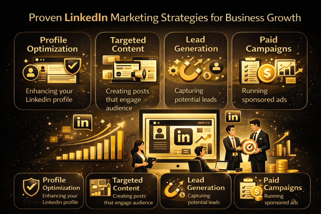
Introduction to LinkedIn Marketing LinkedIn has emerged as a pivotal platform for marketing, especially in the realm of business-to-business (B2B) engagement. Unlike other social media networks that cater to a general audience, LinkedIn is distinctly tailored for professionals and companies, making it a fertile ground for targeted marketing strategies. The platform’s unique proposition lies in its ability to connect professionals across various industries, fostering not only networking opportunities but also collaboration among businesses. This professional focus sets LinkedIn apart, positioning it as an essential tool for any marketing strategy aimed at growth. One of LinkedIn’s standout features is its vast database of professionals, which enables businesses to reach a highly relevant audience. Users on LinkedIn typically include decision-makers and influencers across numerous sectors, providing a unique opportunity for companies to engage with potential clients and partners. Furthermore, the platform allows for various types of content sharing, from articles and posts to videos and infographics, facilitating diverse approaches to audience engagement. Moreover, LinkedIn’s advanced targeting options allow businesses to segment their audience based on industry, job title, company size, and other critical factors. This specificity enhances the effectiveness of marketing campaigns, ensuring that content resonates with the right demographics. Additionally, features such as LinkedIn Groups encourage interaction around shared professional interests, which can enhance brand visibility and credibility. As businesses navigate the digital marketing landscape, LinkedIn stands out as a critical platform to consider. Its professional nature not only bolsters brand presence but also enables companies to build meaningful relationships within their industry. Embracing LinkedIn as part of a comprehensive marketing strategy can drive significant business growth, making it a crucial investment for any organization looking to thrive in the competitive market. Identifying Your Target Audience on LinkedIn Understanding your target audience is a crucial first step in any LinkedIn marketing strategy. It enables businesses to tailor their messaging and approach to effectively reach potential customers. By identifying and analyzing your ideal customer profile on LinkedIn, you can ensure that your marketing efforts resonate in meaningful ways that drive engagement. To begin, it is important to define the characteristics of your target audience. Start by considering factors such as job titles, industries, company sizes, and geographic locations. This information can shape your outreach strategies and content creation processes. Utilizing LinkedIn’s robust analytics tools can provide key insights into the demographics of your current followers and connections, aiding in the refinement of your target audience profile. By analyzing this data, you can understand which groups are responding positively to your content and adjust your marketing strategies accordingly. Segmenting your audience can further enhance your targeting capabilities. For instance, you might categorize your audience into industries like technology, healthcare, or education, or by specific job functions such as marketing, sales, or human resources. This segmentation allows for the creation of personalized content that speaks directly to the needs and pain points of each group. Furthermore, real-world case studies can illustrate the effectiveness of these strategies. Companies that have utilized LinkedIn to understand their audience have often reported significant improvements in engagement and conversion rates. Consistently revisiting and refining your target audience as new data and insights become available can create an agile marketing approach. This not only enhances your presence on LinkedIn but also facilitates ongoing interaction with potential leads, positioning your business for growth and success in a competitive marketplace. Optimizing Your LinkedIn Profile and Company Page Optimizing your LinkedIn profile and company page is critical for enhancing visibility and ensuring that visitors are engaged with your brand. A polished and professional LinkedIn presence can significantly contribute to your business growth by attracting potential clients, employees, and collaborators. To begin with, utilizing relevant keywords throughout your profile is essential. Keywords should reflect the skills, services, and industries you are associated with. This ensures that your profile appears in search results when potential clients or partners are looking for expertise in your domain. Incorporate these keywords naturally in the headline, summary, and experience sections. High-quality imagery is another crucial component. Ensure that the profile picture showcases you professionally, as this creates a strong first impression. Additionally, your company page should feature a branded banner that conveys your company’s unique identity and values. Engaging visuals can make a dramatic difference in drawing attention and interest. Your profile description should be engaging and informative. It should not only highlight your skills but also communicate your accomplishments and the value you bring to your clients. Make use of an active voice, and be specific about your services and how they can benefit others. This alignment with your overall branding strategy reinforces your authority in your field. Furthermore, regularly updating your profile and company page with new content, such as articles, insights, or industry developments, keeps your audience engaged. It also signals to LinkedIn’s algorithm that you are an active participant in your industry, which can increase your visibility. Overall, optimizing your LinkedIn presence through these best practices is fundamental for establishing credibility and enhancing attractiveness in the digital environment. Your LinkedIn profile and company page should not only represent you and your business but also actively contribute to your marketing efforts through increased visibility. Creating High-Quality Content for LinkedIn As LinkedIn continues to grow as a key platform for professional networking and business development, the significance of high-quality content cannot be overstated. Content that resonates with the LinkedIn audience is vital for fostering engagement and building a strong presence. This section explores the types of content that perform particularly well on LinkedIn and outlines effective strategies for creating it. Articles serve as one of the strongest formats for thought leadership on LinkedIn. When writing articles, it is crucial to focus on topics that align with your expertise and that provide real value to your audience. For instance, sharing insights in your industry can position you as a knowledgeable resource. Additionally, infographics are an excellent way to present complex information in a visually appealing manner, making it easier for users to digest. They can capture the
Why Website Management Services Are Essential for Business Websites
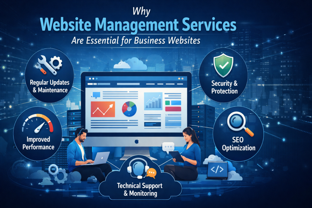
Introduction to Website Management Services In the contemporary digital landscape, businesses increasingly rely on their websites as primary tools for engagement, communication, and commerce. Website management services are essential support systems designed to ensure a company’s online presence operates smoothly and effectively. These services encompass a variety of components, including maintenance, security, content updates, and performance management, which together contribute to a robust digital infrastructure. Website maintenance involves regular updates and troubleshooting to keep the website functioning optimally. This might include checking links, optimizing images, and ensuring compatibility with various browsers and devices. By attending to these details, businesses can prevent downtime, which can lead to lost revenue and diminished customer trust. Security is another critical aspect of website management services. As cyber threats continue to evolve, implementing security measures such as firewalls, malware scanning, and SSL certificates is vital. A secure website not only protects the business and its customers but also enhances the site’s search engine ranking. Businesses that prioritize security in their website management services demonstrate an understanding of their responsibility to safeguard user data. Content updates are equally important. Keeping content fresh and relevant engages visitors and is crucial for search engine optimization (SEO). Regular updates to blogs, articles, and product pages reflect an active commitment to providing value to users, which can significantly improve website traffic and conversion rates. Lastly, performance management ensures that the website runs efficiently, providing users with a seamless experience. This includes monitoring load times and user interactions, as well as optimizing site architecture. These practices are essential since website usability directly influences user satisfaction and retention. Benefits of Outsourcing Website Management Outsourcing website management services presents multiple advantages for businesses seeking to enhance their online presence efficiently. One of the primary benefits is cost-efficiency. By delegating website management tasks to specialized agencies or professionals, businesses can significantly reduce overhead costs. This practice eliminates the need for hiring full-time staff, thereby saving on salaries, benefits, and training expenses. Additionally, outsourcing allows businesses to gain access to advanced tools and technologies without the substantial investment typically required for in-house management. Another crucial benefit is the access to expertise that comes with professional website management services. Companies specializing in this field possess extensive knowledge and experience that may not be found within the organization. They are well-versed in the latest industry trends, SEO best practices, and technical requirements necessary for optimal website performance. This expertise translates into improved website functionality, enhanced user experience, and better search engine rankings, which collectively contribute to increased traffic and conversions. Moreover, outsourcing website management enables businesses to focus on their core activities, allowing them to channel their resources into areas that drive growth and innovation. When organizations are relieved from the daily burden of managing their website, they can redirect their energy towards strategic initiatives. This shift not only improves operational efficiency but also fosters a culture of creativity and productivity. Finally, having dedicated professionals manage the website ensures that it is monitored and maintained consistently. This service provides businesses with peace of mind, knowing that their online platform is in the hands of specialists who can address potential issues proactively. In turn, this leads to better performance stability and a stronger online presence. Overall, outsourcing website management services is crucial for businesses seeking sustainable growth and success in the digital landscape. Impact on Website Security and Compliance Website management services play a crucial role in enhancing security and ensuring compliance for businesses operating in today’s digital landscape. Cyber threats are increasingly sophisticated, making it imperative for companies to adopt a proactive approach to protect their online assets. Regular updates to the website’s software, plugins, and security systems are central to effective website management. These updates not only patch vulnerabilities but also enhance functionality, thereby reducing the risk of unauthorized access and data breaches. By engaging professional website management services, businesses can ensure that their website remains fortified against potential threats. Moreover, the landscape of data protection regulations is continually evolving, necessitating a robust compliance strategy. Many jurisdictions have implemented strict guidelines, such as the General Data Protection Regulation (GDPR) in the European Union, which demands that businesses handle personal data with care and transparency. Failure to comply with these regulations can result in significant fines and damage to a company’s reputation. Regular monitoring and maintenance by dedicated website management professionals ensure that all legal requirements are adhered to, from data storage to user consent protocols. This reduces the risk of non-compliance and builds trust with customers. By incorporating proper website management services, businesses not only improve their security posture but also align their operations with necessary compliance standards. This dual approach not only protects sensitive information and enhances user trust but also fosters long-term business success. In an age where digital interactions are paramount, solid website management enhances both security and compliance, essential pillars for any successful online venture. Continuous Website Performance Monitoring Continuous website performance monitoring is vital for sustaining a website’s speed and overall functionality. In today’s digital landscape, users expect swift and seamless experiences when they engage with online content. A website that performs optimally not only enhances user experience but also contributes significantly to search engine rankings. Therefore, implementing ongoing assessments through various performance metrics is essential. To effectively monitor a website’s performance, several tools and metrics can be employed. Prominent among these tools are Google PageSpeed Insights, GTmetrix, and Pingdom, which provide critical insights into page load times, responsiveness, and overall stability. These platforms not only identify areas for improvement but also track progress over time, allowing businesses to gauge the effectiveness of their optimization strategies. Key metrics include load time, Time to First Byte (TTFB), and the overall speed index. Load time refers to how quickly a webpage loads fully, while TTFB measures the time taken for the server to respond to a request. The speed index provides insight into how quickly the contents of a page are visually displayed, reinforcing the importance of first impressions to users. Regularly
How to Choose the Right Social Media Marketing Services Near Me
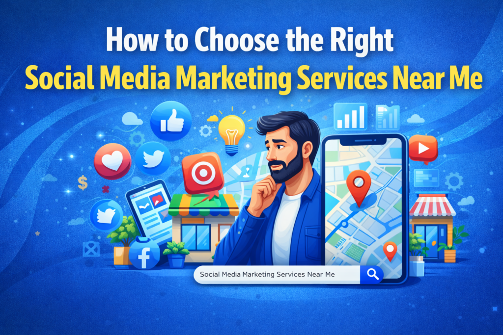
Introduction to Social Media Marketing In the dynamic landscape of today’s digital economy, social media marketing stands as a pivotal strategy for businesses seeking to thrive and grow. Social media platforms, such as Facebook, Twitter, Instagram, and LinkedIn, have transformed the way brands communicate with their target audiences. By harnessing these platforms, businesses can not only enhance their brand visibility but also build authentic relationships with customers. The essence of social media marketing lies in its capacity to engage users, offering a two-way communication channel that enables brands to gather feedback, respond to inquiries, and foster community. Implementing effective social media marketing services allows organizations to tailor their messaging and connect with specific demographics, ensuring that marketing efforts resonate with the intended audience. This targeted approach is instrumental in refining brand identity and positioning, ultimately leading to more impactful engagement. Additionally, social media marketing offers substantial opportunities for driving sales. Through curated campaigns, advertisers can direct users to landing pages, encourage sign-ups, or promote products directly on social media platforms. Tools such as analytics and tracking enable businesses to measure performance and adjust their strategies in real-time, enhancing the effectiveness of marketing efforts. Moreover, the shareability of content on social media means that engaging content can reach a broader audience organically, giving brands the potential to expand their reach significantly. Overall, social media marketing is not just an option but a necessity for businesses in the modern marketplace. Its ability to connect, engage, and influence makes it an indispensable component of any comprehensive marketing strategy. Identifying Your Business Goals Understanding your specific business goals is a critical initial step when selecting social media marketing services. Each business operates under unique conditions and has distinct aspirations, making it essential to clarify these objectives before engaging service providers. By identifying your goals, you can streamline the selection process and optimize your marketing strategies. Common objectives include enhancing brand awareness, which involves promoting your brand across social media platforms to reach broader audiences. A strong presence on platforms like Facebook, Instagram, and Twitter can significantly contribute to this goal, as effective social media marketing services can create compelling content that resonates with target demographics. Another vital objective is customer engagement, focusing on fostering relationships with your audience through interactive content, timely responses to inquiries, and pertinent information sharing. Social media not only facilitates communication between businesses and customers but also builds trust and loyalty. Services that specialize in this area often utilize analytics tools to gauge engagement metrics, ensuring your marketing efforts are effective. Lead generation is yet another goal that businesses might prioritize. Through targeted advertising campaigns and community-building efforts, social media marketing services can help convert followers into potential customers. It is essential to establish clear strategies for capturing leads, including the use of compelling calls to action and engaging offers tailored to your audience’s needs. Finally, improving conversion rates can also serve as a significant goal. This involves not just attracting visitors to your social media pages, but also encouraging them to take favorable actions—whether that be making a purchase, signing up for a newsletter, or engaging in a product trial. Selecting a service provider that understands conversion optimization will ultimately enhance your marketing effectiveness. Researching Local Social Media Marketing Services When embarking on the journey to find local social media marketing services, an organized approach to research is crucial. The first step involves utilizing online tools that specialize in gathering service provider information. Websites such as Google My Business, Yelp, and various local business directories can be instrumental in compiling a list of potential candidates. Be sure to filter your search results by location to ensure the listed services are nearby. Moreover, conducting a thorough search on social media platforms can provide insights into various local agencies. Platforms like Facebook, LinkedIn, and Twitter not only host business pages but also showcase customer feedback and reviews. By examining these platforms, one can gauge the reputation and quality of service provided by the agency. Pay attention to engagement levels on their own social media posts, as this reflects their capability to connect with an audience effectively. Additionally, engaging with local community groups or forums can enhance your research efforts. These groups often share recommendations based on personal experiences, which can be invaluable in narrowing down your choices. Take advantage of discussions in these spaces to gather first-hand insights into various local social media marketing services. Recapping the opinions of local users will offer a well-rounded perspective. Lastly, do not underestimate the power of networking. Attend local marketing events, seminars, or workshops where you can meet representatives from social media marketing agencies in person. Establishing a connection allows for an open dialogue, enabling you to ask questions directly regarding their services, methodologies, and client success stories. Evaluating Services Offered When considering the selection of social media marketing services, it is crucial to examine the array of offerings typically provided by agencies in this sector. The primary services encompass content creation, social media management, paid advertising campaigns, and analytics, among others. Understanding these components will enable potential clients to align their specific requirements with the capabilities of the agency they are evaluating. Content creation stands as a fundamental service, involving the development of engaging materials such as posts, images, and videos tailored to resonate with a target audience. Agencies often employ content creators and strategists to ensure that the material not only aligns with the brand’s voice but also adheres to the latest trends in social media. This aspect of service is vital for building an engaging online presence. Social media management encompasses the administration of an organization’s social media accounts. This includes scheduling posts, engaging with followers, and responding to comments and messages. Effective management ensures a consistent brand presence and fosters community engagement, which is essential in today’s interactive platforms. Additionally, ad campaigns are crucial for reaching a broader audience. Agencies typically provide expertise in designing and implementing targeted advertising strategies across various platforms, ensuring that client promotions are effective
How LinkedIn Marketing Services Help B2B Brands Generate High-Quality Leads

Generating leads in B2B is not about volume. It is about relevance. You do not need one thousand random inquiries. You need fifty conversations with the right decision makers. People who control budgets. People who understand the problem you solve. People who are actively looking for solutions. That is exactly where LinkedIn marketing services make a measurable difference. LinkedIn is not just another social media platform. It is a professional ecosystem built around real identities, verified companies, and business intent. When used strategically, it becomes one of the most reliable channels for generating high quality B2B leads. Let’s break this down properly and understand how linkedin marketing services help brands move from scattered outreach to a predictable, qualified pipeline. Why LinkedIn Is Built for B2B Lead Generation Here’s the thing. Most platforms are built for attention. LinkedIn is built for business. On LinkedIn, people openly display their job titles, industries, company sizes, and career interests. That level of transparency creates a powerful targeting advantage for B2B brands. If you sell enterprise software, consulting services, IT solutions, manufacturing technology, or agency services, your buyers are already on LinkedIn. They are networking, hiring, sharing insights, and exploring partnerships. The mindset is different. When someone logs into LinkedIn, they are not looking for entertainment. They are thinking about growth, strategy, and opportunities. This business intent is what makes LinkedIn marketing services so effective. Instead of interrupting users, you are entering an environment where business conversations are expected. The Real Problem with Traditional B2B Lead Generation Most B2B brands face three common challenges. First, they attract the wrong audience.Second, their sales cycle is too long.Third, their conversion rate is low. Often the issue is not the product. It is positioning and targeting. Running ads on broad networks may generate traffic, but traffic does not equal qualified leads. Cold email campaigns might reach inboxes, but they rarely build authority. Generic content marketing takes time and often lacks precision. LinkedIn marketing services solve this by combining credibility with advanced targeting. You do not just reach people. You reach the right people with the right message at the right stage. That is a big difference. How LinkedIn Marketing Services Build Authority First In B2B, trust drives revenue. No company signs a large contract because of a single advertisement. They invest because they believe the brand understands their challenges and can deliver results. Professional LinkedIn marketing services begin by strengthening your authority. Optimized Founder and Executive Presence In B2B, people buy from people. Your founder or executive profile is often the first touchpoint. When prospects see your content or ads, they check your profile. If it looks vague or inconsistent, trust drops immediately. An optimized LinkedIn profile clearly communicates: When structured properly, your profile becomes a conversion asset. It works like a landing page, building confidence before a single sales call happens. Strategic Content That Attracts Decision Makers Content on LinkedIn is not about posting for the sake of posting. It is about positioning. LinkedIn marketing services develop content strategies that speak directly to your ideal client’s pain points. This could include: Industry insights.Case studies.Short frameworks.Contrarian takes.Lessons from real projects. When your content consistently addresses relevant business challenges, decision makers begin to recognize your expertise. Over time, inbound inquiries start appearing naturally. Not because you chased them. But because you built credibility. Advanced Targeting That Eliminates Guesswork One of the strongest advantages of LinkedIn marketing services is precise targeting. LinkedIn allows advertisers to filter audiences based on: Job title.Seniority level.Industry.Company size.Geography.Skills. Imagine targeting marketing directors in SaaS companies with more than fifty employees in the United States. Or operations heads in manufacturing firms across Europe. That level of control dramatically increases lead quality. Instead of broadcasting your message, you are placing it directly in front of decision makers. This reduces wasted budget and improves conversion rates. LinkedIn Ads That Generate High Quality Leads LinkedIn Ads are powerful when structured correctly. But without strategy, they become expensive experiments. Professional LinkedIn marketing services design full funnel campaigns. This includes cold audience targeting, retargeting layers, and optimized lead capture mechanisms. Lead generation forms on LinkedIn are particularly effective. Users can submit their information without leaving the platform, reducing friction. The real impact comes from alignment between: Audience targeting.Ad messaging.Offer structure.Landing page clarity. For example, offering a tailored audit, industry report, or strategic consultation often performs better than generic content downloads. Decision makers respond to value, not vague promises. When campaigns are monitored and optimized regularly, cost per lead becomes predictable and scalable. Outbound Strategy Using LinkedIn Sales Navigator Inbound marketing is powerful. But outbound, when done intelligently, accelerates growth. LinkedIn Sales Navigator enables businesses to identify highly specific prospects. You can track job changes, company updates, and engagement signals. LinkedIn marketing services often include structured outreach sequences that feel human, not automated. A typical approach includes: Sending a personalized connection request.Sharing a relevant insight or resource.Engaging with the prospect’s content.Opening a conversation around their challenges. This builds relationships rather than pushing sales messages. The result is a steady flow of qualified conversations with decision makers who are already aligned with your target profile. Account Based Marketing for Enterprise B2B If your average deal size is significant, broad marketing is inefficient. Account based marketing focuses on specific target companies rather than large audiences. LinkedIn marketing services support this strategy by identifying key stakeholders within selected accounts and delivering tailored messaging to each decision maker. For example, you might run targeted ads only to executives within ten specific companies. At the same time, your sales team engages them through personalized outreach. This coordinated approach increases visibility within the account and shortens the sales cycle. For enterprise B2B brands, this method can dramatically improve pipeline quality. Retargeting That Converts Warm Prospects Not every prospect converts on the first interaction. This is where retargeting becomes critical. LinkedIn allows you to retarget users who: Visited your website.Engaged with your ads.Opened your lead forms.Watched your videos. LinkedIn marketing services design layered funnels that nurture these
The Importance of Business Process Management Consulting Services for Growing Companies
Introduction to Business Process Management (BPM) Business Process Management (BPM) is a systematic approach that organizations employ to make their workflows more effective, efficient, and adaptable to an ever-changing environment. At its core, BPM involves identifying, modeling, and optimizing a company’s business processes, which are the series of tasks that produce a specific output for customers. The primary objective of BPM is to enhance corporate performance by ensuring that each process contributes positively to business goals. One of the key aspects of BPM is process modeling, which entails creating a visual representation of workflows to better understand them and identify areas for improvement. By using BPM tools and methodologies, companies can dissect their processes into manageable components, making it easier to pinpoint inefficiencies or bottlenecks. Furthermore, modeling supports effective communication among stakeholders, ensuring everyone shares a common understanding of how processes function. Automation is another critical dimension of BPM. Organizations leverage technology to automate repetitive tasks within their processes, thus reducing human error and freeing up employee time for more strategic activities. The automation of workflows enhances speed and efficiency, aligning with the overarching goals of BPM to optimize resource utilization and improve service delivery. Measurement and analysis are crucial components of BPM, as they provide insights into the effectiveness of business processes. By implementing performance metrics and continuous monitoring, organizations can assess the impact of their BPM initiatives. This data-driven approach facilitates ongoing refinements and adaptations to processes, ensuring they remain aligned with organizational objectives and market demands. Overall, BPM stands as an essential practice for companies seeking sustainable growth and improved operational efficiency. The Need for BPM Consulting in Growing Companies As companies progress through various growth stages, they often encounter a range of challenges that can impede their expansion efforts. One such challenge is the emergence of inefficiencies within business operations. When a company scales, processes that were once effective can become strained, leading to delays and confusion. This is where Business Process Management (BPM) consulting comes into play, offering targeted solutions to streamline operations. Another significant issue faced by growing companies is miscommunication between different departments or teams. As organizations expand, the structure of workflows can become increasingly convoluted, resulting in a lack of clarity surrounding roles and responsibilities. By engaging BPM consultants, businesses can establish clearer communication channels, ensuring that team members are aligned with organizational goals and objectives. This alignment not only enhances productivity but also boosts employee morale. Additionally, the absence of structured workflows can stifle growth. In many cases, growing companies rely on informal processes that may have worked prior to scaling, yet fail to support the increased complexity of larger operations. BPM consultants can assist in mapping out and formalizing these workflows, establishing clear procedures that can be easily followed. This structured approach optimizes resource use, minimizes redundancies, and contributes to overall operational efficiency. Ultimately, BPM consulting services are essential for growing companies facing these common challenges. By addressing inefficiencies, improving communication, and implementing structured workflows, organizations are better positioned to manage growth effectively. The implementation of BPM strategies enables businesses to not only sustain their expansion efforts but also thrive in competitive markets. Key Benefits of Engaging BPM Consulting Services Business Process Management (BPM) consulting services play a critical role in enhancing organizational performance. One of the most significant benefits of engaging BPM consultants is the increased efficiency in operations. By analyzing existing processes, BPM consultants identify inefficiencies and bottlenecks that hinder productivity. This analysis enables companies to streamline processes, reduce redundancies, and ultimately achieve better resource allocation, leading to improved operational performance. Cost reduction is another key advantage associated with BPM consulting. Through the optimization of business processes, companies can minimize operational costs. Effective BPM allows organizations to allocate their resources more wisely, making better use of technology and manpower. Companies often discover that even small adjustments to workflows can result in significant savings, thereby enhancing profitability. Improving customer satisfaction is also a noteworthy benefit of BPM consulting. By refining processes, businesses can provide a smoother, more efficient experience for their customers. This may include faster response times, improved product delivery, and more responsive customer service. Satisfied customers are likely to become repeat clients and contribute to positive word-of-mouth marketing, which is invaluable for company growth. Furthermore, BPM consulting services equip organizations with the agility to adapt to market changes effectively. In today’s fast-paced business environment, companies face numerous challenges that can disrupt operations. Engaging BPM consultants enables organizations to develop processes that are flexible and responsive to changes in the market landscape. This adaptability ensures that organizations remain competitive and can pivot strategies as necessary. Examples of successful outcomes from BPM consulting abound. Many companies that have adopted BPM practices report increased efficiency ratios and reduced operational costs. Such transformations not only support short-term goals but also align with long-term strategic planning, confirming the value of hiring BPM consultants. BPM Consulting Services: What to Expect When engaging a Business Process Management (BPM) consulting firm, companies can anticipate a range of services tailored to enhance their operational efficiency. One of the primary offerings is process mapping. This service involves creating a visual representation of the current workflows within an organization. Through process mapping, BPM consultants identify inefficiencies and redundancies, enabling businesses to gain deeper insights into their operations. Another critical service provided by BPM consultants is gap analysis. This process involves evaluating the current operational state against desired outcomes or industry standards. By pinpointing discrepancies, consultants guide organizations in understanding what changes are necessary to reach their goals. Gap analysis typically serves as a foundational step before initiating further transformations. Furthermore, BPM consulting firms often offer process re-engineering services. This entails the redesign of existing processes to improve performance and efficiency. Consultants work collaboratively with stakeholders to innovate processes, ensuring that they align with the company’s strategic objectives and resonate with best practices in the industry. The goal is to streamline operations while simultaneously enhancing quality and customer satisfaction. Lastly, the implementation of BPM technologies is a critical
How Business Management Consulting Services Improve Operational Efficiency

Introduction to Business Management Consulting Business management consulting refers to the practice of providing professional guidance and expertise to organizations in order to solve complex operational challenges, improve efficiency, and enhance overall performance. These services encompass a wide range of disciplines including strategic planning, operational improvements, organizational restructuring, and human resources management. The primary objective of business management consultants is to identify underlying issues within a business and implement effective solutions tailored to meet its unique needs. Consultants are often engaged to analyze current business practices and workflows, pinpoint inefficiencies, and recommend actionable strategies for improvement. By leveraging their extensive knowledge and experience, they assist organizations in gaining objective insights that can lead to transformative outcomes. This process typically involves conducting in-depth assessments, market research, and data analysis to formulate strategies that align with the business’s goals. The role of consultants extends beyond merely providing recommendations; they also facilitate the implementation of these strategies. This often includes training staff, managing change initiatives, and monitoring progress to ensure that the desired outcomes are achieved. Moreover, consultants bring a fresh perspective, often helping businesses to see beyond internal biases and habitual practices, which can impede growth and adaptation in a rapidly evolving market. In addition to problem identification and solution implementation, business management consultants serve as valuable partners in fostering a culture of continuous improvement within organizations. By establishing systematic processes for measuring performance and outcomes, they enable businesses to adapt to changes and sustain operational efficiency over time. Ultimately, the contribution of management consulting services is crucial for organizations striving to enhance their business performance and maintain a competitive edge in their respective industries. Understanding Operational Efficiency Operational efficiency refers to the ability of an organization to deliver products or services to its customers in the most cost-effective manner while maintaining high quality. This concept is critical in today’s fast-paced business environment, where companies are continually seeking ways to optimize their processes and enhance their productivity. Achieving operational efficiency not only involves streamlining operations but also ensuring that all resources, including human, technological, and financial, are utilized effectively. The significance of operational efficiency cannot be understated. For businesses, it serves as a key performance indicator, driving the overall performance and sustainability of the organization. By improving operational efficiency, companies can reduce costs, minimize waste, and maximize resource utilization. This leads to significant cost savings, which can then be reinvested to foster innovation and growth. Moreover, enhanced operational efficiency can improve service delivery, leading to higher customer satisfaction and loyalty. Furthermore, operational efficiency is intrinsically linked to productivity. A business that operates efficiently can adapt more readily to changes in the market, respond quickly to customer needs, and capitalize on new opportunities. The better an organization’s processes are configured, the more likely it is to maintain a competitive edge. Organizations often measure operational efficiency through various metrics such as cycle time, throughput, and return on investment. Consequently, a comprehensive understanding of operational efficiency equips businesses with the insights needed to make informed decisions about improvement initiatives. The Role of Consultants in Analyzing Operations Business management consultants play a pivotal role in enhancing a company’s operational efficiency by meticulously analyzing existing processes and operations. Their primary objective is to identify inefficiencies that may hinder organizational performance. To achieve this, consultants employ a variety of analytical tools and methodologies, each tailored to the specific challenges faced by the business. One effective tool utilized by consultants is the SWOT analysis, which assesses a company’s Strengths, Weaknesses, Opportunities, and Threats. This strategic approach allows consultants to provide a comprehensive overview of the internal and external factors influencing operational effectiveness. By categorizing these elements, consultants can pinpoint specific weaknesses or threats that may contribute to inefficiencies. Additionally, process mapping is a crucial methodology employed to visually document workflows and processes. This technique enables consultants to scrutinize each step involved in a particular operation, highlighting redundancies and bottlenecks that could be contributing to delays or increased costs. Through detailed mapping, inefficiencies become more evident, allowing for more targeted interventions. Furthermore, consultants may also leverage data analytics to examine key performance indicators (KPIs) and operational metrics. By assessing quantitative data, they can identify patterns and trends that indicate areas for improvement. The integration of these insights facilitates a data-driven approach to operational enhancement, ensuring that recommendations are based on solid evidence rather than assumptions. In conclusion, the analytical role of business consultants is critical for identifying operational inefficiencies through various methods such as SWOT analysis and process mapping. By using these tools, consultants provide invaluable insights that inform strategic decisions aimed at improving overall operational effectiveness. Identifying Areas for Improvement In the realm of business management consulting, the process of enhancing operational efficiency begins with a detailed assessment of a company’s existing practices and processes. Consultants approach this critical task through multiple techniques that include data acquisition, stakeholder interviews, and benchmarking against industry standards. These methodologies enable consultants to pinpoint specific areas where businesses can improve their operational efficiency, ultimately driving better results. Data acquisition is one of the foremost steps in identifying potential inefficiencies. This involves collecting quantitative and qualitative data related to workflows, resource utilization, and performance metrics. By analyzing this information, consultants can gain insights into areas experiencing bottlenecks or underperformance. This data-driven approach means that the recommendations generated are backed by concrete evidence, allowing companies to make informed decisions. Equally significant is the role of engaging stakeholders through interviews. Consultants conduct discussions with various employees—ranging from management to entry-level staff—to gather diverse perspectives on operational challenges. These interviews reveal not only the pain points within processes but also highlight internal suggestions for improvement that may otherwise go unnoticed. Insights gathered from these interactions can uncover systemic issues that require addressing to improve overall efficiency. Finally, benchmarking against industry standards serves as a vital component in the evaluation process. By comparing a company’s performance to established best practices and metrics within its industry, consultants can discern where certain operations may be falling short. This comparative