
Mobile SEO: Why It Matters More Than Ever
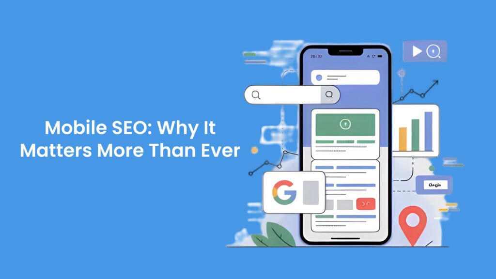
Introduction to Mobile SEO Mobile SEO refers to the strategies and practices implemented to optimize a website for mobile devices. As more users access the internet on smartphones and tablets, the importance of mobile SEO has soared. According to recent statistics, over half of global web traffic now comes from mobile devices, a trend that highlights the necessity for websites to provide seamless experiences across various screens. This shift has mandated a reevaluation of traditional search engine optimization (SEO) approaches, leading to unique strategies tailored specifically for mobile platforms. Search engines, particularly Google, have recognized the prevalence of mobile browsing and adapted their algorithms accordingly. In 2015, Google announced mobile-friendliness as a ranking signal, impacting how websites are indexed and ranked in search results. This pivotal change underscored the necessity for webmasters to prioritize mobile responsiveness to maintain or improve their visibility in search engine results pages (SERPs). A mobile-friendly website not only enhances user experience but also boosts search engine rankings, which is crucial for driving organic traffic. The landscape of digital engagement continues to evolve, with mobile device usage expected to increase. Users today expect websites to load quickly, display correctly, and function effectively regardless of the device they are using. Failure to meet these user expectations may lead to higher bounce rates and decreased user satisfaction, ultimately harming a brand’s online presence. As mobile browsing becomes the norm, understanding and implementing Mobile SEO has never been more critical for businesses seeking to maintain competitive advantage in an increasingly digital world. The Importance of Mobile Traffic In today’s digital landscape, mobile traffic has gained an undeniable prominence, fundamentally altering the way users interact with online content. Recent studies indicate that over half of global web traffic now originates from mobile devices, a trend that highlights the shift in consumer behavior towards mobile-centric usage. This surge can be attributed to the increasing ownership of smartphones, improved mobile internet speeds, and the rise of mobile applications, all contributing to an environment where users prefer accessing information on the go. The implications of this trend are substantial for businesses. As more consumers rely on their mobile devices for shopping, browsing, and seeking information, a website’s mobile-friendliness is no longer optional; it has become a necessity. Companies that prioritize mobile optimization not only enhance user experience but also stand to benefit from higher engagement rates, reduced bounce rates, and improved conversion rates. Furthermore, search engines like Google have begun to penalize websites that do not offer a seamless mobile experience, which reinforces the need for businesses to invest in mobile SEO strategies. Alongside the technical aspects of mobile traffic, customer expectations have also evolved. Mobile users now anticipate rapid load times, streamlined navigation, and intuitive interfaces. A study revealed that 53% of mobile users abandon sites that take longer than three seconds to load, signifying that even slight delays can lead to significant losses in engagement. Consequently, businesses must adapt to these expectations by ensuring that their websites not only function efficiently on mobile devices but also provide valuable, relevant content tailored to mobile users. As the digital world continues to embrace mobile platforms, it becomes increasingly critical for businesses to recognize the importance of mobile traffic. By doing so, they can create robust strategies that prioritize mobile user experience and remain competitive in an ever-evolving online marketplace. Google’s Mobile-First Indexing Google’s mobile-first indexing is a significant shift in how the search engine evaluates websites. Traditionally, Google primarily used the desktop version of a website for indexing and ranking. However, as mobile internet traffic has surged, Google recognized the need to adapt its approach, prioritizing mobile versions of websites instead. This adjustment entails assessing the mobile site content, performance, and user experience over desktop equivalents. Consequently, mobile-first indexing implies that the mobile version of a website serves as the primary source of information for Google’s algorithms when determining its relevance and ranking for search results. For webmasters and SEO professionals, this transition signals a critical need to ensure that the mobile version of a site is fully optimized. Websites must be designed responsively, which means that they should automatically adjust their layout and content based on the screen size of the device being used. A responsive design not only enhances usability for visitors accessing the site via mobile devices but also aligns with Google’s criteria for mobile-first indexing. If a website does not have a responsive design, it risks losing visibility in search results, adversely affecting organic traffic and overall site performance. Additionally, it is crucial for webmasters to focus on optimizing mobile content quality, page loading speed, and navigational ease. These factors greatly influence user experience and can directly impact a site’s ranking. By adopting a mobile-first mindset, businesses can effectively meet the demands of today’s users, who consistently seek seamless and accessible online experiences. Ultimately, aligning with Google’s mobile-first indexing is not merely a best practice; it is increasingly becoming a necessity for maintaining competitiveness in an evolving digital landscape. Key Factors for Mobile SEO Success As mobile usage continues to rise, optimizing websites for mobile devices has become imperative. The key factors for achieving success with mobile SEO encompass several critical elements, including page load speed, mobile-friendly design, content optimization for smaller screens, and overall user experience considerations. One of the primary factors influencing mobile SEO is page load speed. Research indicates that faster-loading pages significantly enhance user engagement and decrease bounce rates. Users expect quick access to information, particularly on their mobile devices where patience is limited. To improve load speed, website owners should minimize large files, leverage browser caching, and implement AMP (Accelerated Mobile Pages) technology, which is specifically designed to boost mobile performance. The second essential factor is having a mobile-friendly design. Responsive design ensures that a website adapts seamlessly to various screen sizes, providing a consistent experience across devices. Adopting a flexible grid layout and utilizing scalable images is vital. Additionally, navigation should be simplified to accommodate the touchscreen interface, allowing users to easily
How to Optimize Blog Posts for SEO

Introduction No matter how strong a company is or how ambitious the leadership team may be, the reality is simple. A blog that does not rank will not bring traffic. A blog without traffic will not influence buyers. And without influence, it becomes hard to grow revenue or build trust in any competitive market. Leaders feel this pressure every single day. You invest time, money and talent into content, yet the results often fall short. Posts disappear into the noise. Organic traffic plateaus. Conversions stay weak. The team keeps producing content but never quite cracks the formula that Google rewards. This is where a clear strategy for blog SEO becomes a turning point. When you optimize blog posts the right way, every article starts working like an asset that attracts search traffic, builds authority and moves prospects closer to a business decision. At Amatrons, we have seen this happen across industries. Once a team understands how to create an SEO friendly blog, everything else becomes easier. Content becomes predictable. Organic leads rise. And founders, CEOs and decision makers finally feel that their investment in content is paying off. Let’s break it down in a practical way so you get a clear roadmap you can apply immediately. Why Optimizing Blog Posts Matters for Growth Many leaders underestimate how much a well optimized blog can impact revenue. Organic search is still the highest intent traffic source. When people search, they are looking for answers, solutions, guidance or vendors. If your content is not visible, the opportunity never reaches you. When your blog SEO is strong. Your brand builds trust faster. Buyers spend more time with your content. Your acquisition cost drops. Your sales cycle becomes lighter. Your website becomes the first touchpoint in the buying journey. This is why SEO for bloggers and content teams is a leadership priority today. It is not a marketing task. It is a growth system. The Gap Most Companies Struggle With Before we move into the solutions, let’s acknowledge the real struggle leaders face. Content teams write without a strategic keyword plan. Writers create posts that sound good but lack SEO structure. There is no balance between clarity, user experience and search intent. Technical SEO is ignored at the blog level. Most blogs do not have internal linking. Headings are not optimized. Images are not optimized. The blog layout is not reader friendly. And worst of all, blogs do not answer real business questions buyers care about. At Amatrons, we work with founders and CXOs who share the same frustration. The problem is not effort or talent. It is lack of a structured SEO process. Let’s walk through how to fix that. Understanding Search Intent Before Writing The first roadblock leaders face is misunderstanding search intent. When the intent behind a keyword is unclear, the blog ends up confusing both readers and Google. ChallengeMany writers choose keywords simply because they have high volume. But if the intent behind the search does not match the content you create, your post will never rank. SolutionStudy the search intent before writing anything. Open the first ten results for your keyword and analyze what people are truly looking for. For exampleA keyword like SEO friendly blog usually means readers want guidelines they can implement immediately.The keyword blog SEO tips signals that readers want a list type post with practical steps. When you match intent correctly, Google sees your article as the most helpful answer, which lifts your ranking and drives qualified traffic. Structuring Your Blog for SEO Impact ChallengeMost leaders assume SEO is all about keywords. In reality, structure plays a major role. A blog that is hard to read or navigate loses readers quickly. Google notices that drop in engagement and lowers your ranking. SolutionUse a clear blog structure that is easy to scan. Here is the structure we use at Amatrons for high ranking postsA simple introduction focused on the pain point Short paragraphs Clear subheadings Natural placement of keywords Real examples and micro case insights A summary or conclusion with next steps Internal links to relevant service or product pages When your structure is clean, your content stays readable. Leaders appreciate this clarity, and search engines reward it. Doing Keyword Research the Right Way ChallengeTeams often pick random keywords or target overly competitive ones. Without a clear keyword strategy, your blog will never reach the first page. SolutionChoose your keywords using three factors Search volume Keyword difficulty Buyer relevance Here is a simple example table showing how a content strategist at Amatrons would evaluate keywords for a blog about SEO optimization. Keyword Search Volume Difficulty Buyer Relevance SEO blog writing Medium Low High Optimize blog posts High Medium High SEO friendly blog Medium Medium High SEO for bloggers Medium Low Medium Blog SEO tips High Low High This matrix helps leadership teams prioritize keywords that have the highest chance of ranking and also attract buyers who are more likely to convert. Writing SEO Friendly Blog Content That Feels Human ChallengeMany blogs overstuff keywords, sound mechanical or feel too promotional. Leadership readers sense this immediately and lose interest. SolutionBlend SEO writing with human storytelling. Here is how you make your blog SEO friendly while keeping it natural Use keywords in headings, first paragraph and conclusion Add real business insights Include numbers, comparisons and real world scenarios Avoid fluff and filler Speak directly to the reader’s challenge For example, instead of writingSEO friendly blogs help companies grow Write something more humanWhen your blog becomes search friendly, your visibility grows and your pipeline grows with it. This is where SEO starts supporting real business outcomes. On Page SEO Elements That Drive Higher Rankings ChallengeMost companies miss simple on page SEO elements that influence ranking power. Even if the blog is well written, missing these elements weakens performance. SolutionOptimize the following on page elements every time Title tag Meta description Headings URL structure Image alt text Internal links Outbound links Schema markup if relevant Think of on page SEO as
Link Building Strategies for Beginners

A Leadership Friendly Guide To Backlinks That Actually Drive Growth Introduction Business leaders today are under constant pressure to protect revenue, improve visibility and keep their brand ahead of competitors. When a company invests in digital growth, one question always comes up. How does the business rise in organic search without spending endlessly on paid campaigns. This is where link building steps in.Link building or building high quality backlinks is more than an SEO tactic. For a CEO or founder, it is a direct lever for credibility, authority, reputation and long term digital strength. If a business wants predictable traffic, consistent lead flow and higher customer trust, backlinks become non negotiable. But here is the problem.Most leaders hear mixed messages about backlinks for beginners. Some say link building is complicated. Others say it is risky. Many still think all backlinks are equal. And when leaders get confused, they delay the decision, which slows down growth. The purpose of this guide is simple.Make link building clear, practical and business ready for you. If you are a decision maker or the owner of a company, this guide will help you understand the real impact of SEO link building, why white hat backlinks matter in 2025 and how a beginner can build a link strategy that actually produces ROI. Amatrons has helped multiple companies shape these strategies and this blog reflects that real world experience. Why Link Building Matters For Business Leaders The first challenge is understanding why link building needs attention when there are so many other priorities. Leaders are already handling hiring, sales, operations and finances. SEO link building may feel secondary because results are not always instant. Here is what leaders often miss.Google treats backlinks as votes of trust. When respected websites link to your pages, it signals that your brand is credible. It influences ranking, brand authority and customer perception at the same time. What this means for your business• Higher organic visibility• Lower dependency on paid ads• Stronger customer trust• Higher conversion rates due to perceived authority• Long term ranking stability• A competitive advantage that is very difficult to copy Below is a simple view that shows how backlinks influence performance. Area of Impact With Strong Link Building Without Link Building Visibility High ranking across target keywords Slow ranking and inconsistent traffic Customer Trust Brand seen as reliable and authoritative Brand seen as new or unverified Lead Generation Predictable organic leads Reliance on paid campaigns Cost Efficiency Lower long term acquisition costs Higher cost per lead Competitive Strength Hard for competitors to overtake Competitors easily outrank you This comparison alone explains why white hat backlinks are not optional for any serious business owner. The Real Challenge Most beginners fail at link building because they take one of these paths.• They buy low quality backlinks that put their business at risk.• They rely on old techniques that Google no longer rewards.• They chase volume instead of value.• They ignore relevance and authority.• They assume link building is a one time task. For a company leader, these mistakes can lead to wasted budgets, poor results and even SEO penalties. A proper link strategy 2025 requires clarity, structure and consistent execution. Let us break down how it should actually work. Understanding Backlinks For Beginners A beginner usually faces one simple question. What exactly is a backlink. A backlink is a link from another website pointing to your site. Google views every link like a signal that your content is worth trusting. The more credible the linking website, the stronger the impact. Three qualities matter the most.• Relevance• Authority• Quality If a business sells software, a backlink from a respected tech blog is far more valuable than fifty backlinks from unrelated low authority sites. Leaders need to focus their energy on strategic relevance instead of sheer numbers. The Leadership Perspective From a leadership angle, backlinks are similar to partnerships. You do not grow by connecting with everyone. You grow by connecting with the right people. Your link building approach needs the same mature mindset.• Fewer but meaningful relationships• Authentic content that earns recognition• Zero shortcuts• Steady and predictable growth This is why white hat backlinks always win. They protect your business and strengthen your long term authority. Core Link Building Strategies For Beginners Each strategy below begins with the challenge business owners face and then provides the right solution. 1. Guest Posting With Purpose The challengeMost beginners write low quality guest posts or publish on random sites with no long term value. This results in weak backlinks that do nothing for ranking. The opportunityTarget industry relevant publications and offer expert level content. Leaders who invest time in this earn authority driven backlinks that boost both SEO and brand trust. What to do• Create a list of industry portals that accept contributors• Send them high quality articles that solve real industry problems• Include a subtle backlink to your website in the author bio or within the article When done correctly, guest posting builds reputation in your niche and improves your link profile naturally. 2. Business Listings and Profiles The challengeMost companies create incomplete or inconsistent business listings. Some do not claim listings at all. This weakens local SEO and credibility. The opportunityVerified business profiles provide stable white hat backlinks. For any beginner, these are safe foundational links. Where to list• Google Business Profile• Bing Places• Crunchbase• Product Hunt• Clutch• GoodFirms• Trustpilot• Local business directories in your region This step builds the base layer of your link ecosystem. 3. Content That Earns Backlinks The challengeMany leaders publish content only to fill their website. They do not publish content that others want to refer to. This results in no backlink growth. The opportunityHigh quality educational content attracts organic backlinks without any outreach. Create content that answers deep industry doubts or offers unique insights. Examples of link earning content• Industry reports• How to guides• Research backed insights• Case studies• Trend analysis• Comparison articles This works perfectly for beginners because great content naturally pulls attention. 4.