
What Is Responsive Web Design?
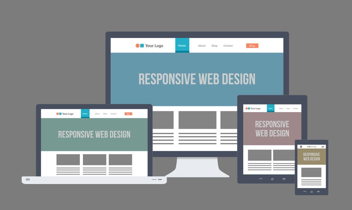
Responsive design is a web development approach that aims to create web pages that provide an optimal viewing experience across a wide range of devices. This includes desktop computers, tablets, smartphones, and even emerging devices like smartwatches. The primary goal of responsive design is to ensure that users can easily navigate and interact with websites regardless of the screen size or orientation. It accomplishes this through several key principles, namely fluid grids, flexible images, and media queries.
Fluid grids form the foundation of responsive web design by allowing layout elements to resize and rearrange based on the user’s screen size. Instead of using fixed pixel dimensions, fluid grids utilize relative units like percentages, which allow elements to proportionally scale. This flexibility ensures that a website’s structure remains intact, whether viewed on a large monitor or a small smartphone display.
In addition to fluid grids, flexible images play a crucial role in responsive design. This principle involves using images that can scale within the confines of their parent elements, rather than being constrained by fixed dimensions. Techniques such as CSS properties like “max-width: 100%” help images resize appropriately, permitting them to maintain their aspect ratios and preventing distortion on various devices. This approach significantly enhances the user experience by ensuring visual content remains clear and engaging, regardless of the viewing medium.
Finally, media queries are essential for applying different styles based on the characteristics of the device being used. These CSS rules allow developers to set specific breakpoints, altering the layout and design according to factors like the viewport size or screen resolution. This versatility is vital in catering to a diverse audience, ensuring that all users receive an equally functional and visually appealing experience. Understanding these principles is crucial for any business aiming to enhance its online presence in today’s mobile-centric world.
The Growing Use of Mobile Devices
In recent years, the prevalence of mobile devices has dramatically increased, reshaping how consumers interact with the digital world. Smartphones and tablets have become ubiquitous, allowing users to access the internet anytime and anywhere. According to recent statistics, mobile devices account for over half of global web traffic, with that number continually rising as technology advances and mobile connectivity improves.
Consumer behavior has shifted significantly towards mobile web browsing. As more individuals rely on their devices for everyday tasks, including shopping, social networking, and information gathering, businesses must recognize this change. Research has indicated that nearly 80% of consumers use their mobile devices to research products before making a purchase, underscoring the importance of having a mobile-friendly website. Additionally, it has been reported that mobile users are more likely to engage with content that is optimized for their devices, leading to higher conversion rates for businesses that prioritize responsive design.
Furthermore, the impact of mobile usage extends beyond mere consumption of information. The average user spends close to 3 hours daily on mobile applications, which highlights the significance of creating an accessible and enjoyable browsing experience. Companies that fail to adapt their websites for mobile users risk losing potential customers and harming their overall online presence. An increasing number of web users expect fast-loading, visually appealing sites that function seamlessly across various screen sizes. Therefore, adopting a responsive design approach has become integral to business strategies aiming to capture the mobile market and enhance user experience.
In light of these trends, it is clear that businesses must invest in responsive design to meet the needs of their mobile clientele effectively. Ignoring this shift could result in lost opportunities and diminished customer satisfaction.
How Responsive Web Design Improves User Experience
In the digital landscape, where users access websites through a myriad of devices, from smartphones to tablets and desktops, the importance of responsive design cannot be overstated. Responsive design ensures that a website adapts efficiently to various screen sizes and resolutions, providing users with a seamless experience. This adaptability significantly enhances user experience (UX), addressing the diverse preferences and behaviors of users.
A seamless performance across different devices plays a critical role in reducing bounce rates. When users encounter a website that is not optimized for their device, they are likely to leave almost immediately, contributing to increased bounce rates. Conversely, a responsive design ensures that elements are displayed correctly and that navigation is intuitive, keeping users engaged. This engagement is essential, as it can lead to users spending more time on the site, exploring various offerings, and consuming content without frustration.
In addition to reducing bounce rates, responsive design fosters higher user engagement. When visitors feel that a website is tailored for their device, they are more likely to interact with its content, whether it’s clicking through pages, signing up for newsletters, or making purchases. This engagement not only creates opportunities to build a relationship with the user but also increases the likelihood of conversion. Responsive websites have been shown to experience higher conversion rates, as users find it easier to complete tasks and navigate through their purchasing journey.
Overall, prioritizing responsive design translates to significant benefits, including enhanced user satisfaction and increased likelihood of repeat visits. A well-designed responsive website ultimately serves as a solid foundation for improving user experience, encouraging customer loyalty, and boosting business success.

SEO Benefits of Responsive Web Design
Responsive design plays a pivotal role in enhancing search engine optimization (SEO) for businesses. With an increasing number of internet users accessing websites through mobile devices, search engines like Google have prioritized mobile-friendly sites in their ranking algorithms. Consequently, websites utilizing responsive design are more likely to achieve higher visibility in search engine results pages (SERPs). This approach allows a single, adaptable website to serve various devices, ensuring a seamless user experience regardless of screen size.
One significant advantage of responsive design is the elimination of duplicate content. Traditional mobile sites often consist of separate URLs for desktop and mobile versions, which can lead to fragmentation of traffic and diluted SEO efforts. In contrast, responsive websites employ a single URL that caters to all devices. This consolidation enhances the website’s authority and signals to search engines that the content is relevant across different platforms, thus improving its ranking potential.
Additionally, Google rewards websites that exhibit lower bounce rates and higher engagement levels, both common traits of responsive sites. When users experience fast loading times and easy navigation on their preferred devices, they are more likely to stay on the site longer, leading to a positive user experience. Engaging visitors effectively not only boosts the website’s credibility in the eyes of search engines, but it can also convert leads into customers, further solidifying the business’s online presence.
In essence, adopting a responsive design is not merely a matter of aesthetic preference; it is a strategic decision that significantly influences SEO performance. Businesses that invest in responsive solutions can expect improved trust from search engines, ultimately enhancing their visibility and competitiveness in an increasingly digital marketplace.
Responsive Web Design and Brand Credibility
Implementing responsive design is not only a strategic move for enhancing user experience but also offers substantial cost benefits for businesses. One of the primary advantages is the consolidation of web development efforts; rather than creating and maintaining individual websites for desktop and mobile versions, businesses can operate a single responsive site that adapts seamlessly to various screen sizes. This streamlined approach significantly reduces the time and resources required for both initial development and ongoing maintenance.
Maintaining separate websites for desktop and mobile platforms can lead to increased expenses due to duplicated content, additional hosting costs, and the need for separate SEO strategies. With responsive design, businesses can ensure that all devices access the same content, which simplifies content management. Managers and developers can make updates or changes uniformly across the site, rather than handling multiple updates for different platforms, leading to both time savings and a lower overall expenditure on web management.
From the perspective of developers, the adoption of responsive design fosters a more efficient workflow. They can focus on optimizing a single codebase, reducing complexities associated with having to switch between multiple sites. Further, the need for continuous updates is lessened when all modifications are made in one place. This practice not only enhances productivity but also minimizes potential inconsistencies in user experience across different devices.
In light of these considerations, it is evident that responsive design is a cost-effective solution for businesses looking to optimize their online presence. By minimizing the need for separate platforms and streamlining maintenance processes, organizations capitalize on a versatile website that caters to a diverse audience while containing overhead costs. The long-term financial benefits are substantial, underscoring the necessity of adopting responsive design in today’s digital landscape.
Building Brand Credibility
In today’s digital landscape, a business’s website serves as the primary platform for engagement between the brand and its customers. Responsive design plays a pivotal role in establishing and maintaining brand credibility. A website that is adaptable to various screen sizes enhances user experience, which reflects positively on the brand. When consumers encounter a mobile-friendly website that performs well across devices, they are more likely to perceive the brand as professional and trustworthy.
Conversely, businesses with outdated or non-responsive websites risk damaging their reputation. Users may view such sites as a signal that the business is behind the times or lacks attention to detail. This perception can lead consumers to question the reliability of the business itself, potentially driving them towards competitors that offer a superior online experience. A poor website experience can rapidly erode trust and deter users from making purchases or engaging with the brand further.
A modern, responsive website does not only cater to aesthetics but fundamentally communicates a brand’s commitment to quality and customer service. When a site adjusts seamlessly to the device being used, it demonstrates to the consumer that the business values their experience and fosters a sense of assurance. Studies show that users are more likely to remain on a site that is easy to navigate, which increases the chances of conversions and encourages repeat visits.
Incorporating responsive design into a brand’s website strategy is thus an essential step towards enhancing brand trust and credibility. It conveys professionalism and reliability, qualities that consumers look for when selecting a brand to engage with. The investment in a responsive design is not just about visual appeal; it is about building a long-lasting relationship with the audience built on trust and credibility.
How Responsive Web Design Future-Proofs Businesses
In the rapidly evolving digital landscape, the importance of a responsive design cannot be overstated. As technology progresses, new devices with varying screen sizes and resolutions continue to emerge, altering the way users interact with websites. A responsive web design adapts seamlessly to these changes, ensuring that content remains accessible and visually appealing across all platforms. This adaptability is crucial for businesses aiming to maintain a competitive edge in an ever-changing environment.
Moreover, consumer expectations are constantly shifting. Today’s users demand instant access to information, regardless of the device they are using. A mobile-first approach to responsive design directly addresses these expectations by prioritizing mobile optimization, which is increasingly vital as mobile internet usage continues to rise. Companies that embrace adaptive web design will find themselves better equipped to meet these demands, ultimately leading to improved user experience and satisfaction.
The integration of emerging technologies also plays a significant role in the necessity of responsive design. As the Internet of Things (IoT) and wearable tech gain traction, the range of devices that consumers use to access websites will only increase. Consequently, businesses that implement a flexible, responsive design can effectively future-proof themselves against these trends. Such design not only accommodates new technology but also supports ongoing changes in user behavior, facilitating a smoother transition as these trends evolve.
In light of these considerations, it is clear that investing in responsive design is not merely a trend but a strategic move for businesses. By doing so, companies can position themselves favorably for continued growth and relevance in the digital marketplace. Ultimately, businesses that prioritize responsive web design will undoubtedly secure a robust foundation for future success amid technological advancements and changing user expectations.
Responsive Web Design Case Studies
The implementation of responsive design has emerged as a crucial strategy for many businesses seeking to enhance their online presence. Companies across various industries have successfully adopted this design approach, yielding significant improvements in user engagement and sales performance. One notable example is the online retailer, Amazon. After integrating responsive web design, Amazon reported a remarkable increase in mobile traffic and conversion rates. This transition allowed users to enjoy a seamless shopping experience across different devices, ultimately contributing to an uplift in overall sales by 20%.
Another illustrative case is that of Starbucks. The coffee chain revamped its website with a responsive design to cater to the growing number of mobile users. By prioritizing user experience, Starbucks ensured that potential customers could easily navigate their site irrespective of the device used. This strategic move resulted in a 25% increase in app engagement and a noticeable surge in monthly orders, demonstrating how responsive design can significantly impact customer behavior and drive sales.
In the hospitality sector, the InterContinental Hotels Group (IHG) serves as an exemplary model. After implementing a responsive design, IHG experienced a 30% increase in mobile bookings within just six months. By optimizing their site for various screen sizes, they delivered a more engaging and user-friendly experience. The improvements were reflected in their analytics, as well, with lower bounce rates and higher satisfaction scores recorded from mobile users.
Collectively, these case studies underline the pivotal role of responsive design in today’s digital landscape. Companies that adopt such strategies not only improve their website’s accessibility but also enhance customer experience, which is invaluable for driving both traffic and conversions. The evidence suggests that responsive design is not merely a trend but a fundamental requirement for any business aiming to thrive in the competitive online marketplace.
Conclusion – Why Responsive Web Design Is a Business Necessity
In today’s digital landscape, the importance of responsive design cannot be overstated. It serves as a critical component for modern businesses seeking to enhance user experience, improve accessibility, and ultimately drive conversions. A well-implemented responsive design not only accommodates various devices but also adapts to a diverse range of screen sizes, ensuring that users can interact with your content seamlessly, regardless of their device. This adaptability leads to increased customer satisfaction and loyalty, which are essential for sustaining long-term business success.
As we reflect on the pivotal role that responsive design plays, it becomes evident that businesses must prioritize the optimization of their websites. One of the first steps in this process is to evaluate your current website’s performance across different devices. Utilize responsive design testing tools to identify areas of improvement. This evaluation will allow you to pinpoint specific elements that may hinder user experience and require adjustments.
Once you have assessed the current state of your website, consider collaborating with professional web designers or developers specializing in responsive design. Their expertise will guide you in crafting a user-centric experience tailored to the needs of your audience. Emphasize designing with mobile in mind, as an increasing number of users browse the internet primarily on smartphones and tablets. Moreover, remember to optimize images and other media to ensure fast loading times across all devices, as this is crucial for retaining visitor engagement.
Finally, continuously monitor and analyze user interactions using analytics tools. Gathering feedback from users can provide invaluable insights for further refinement of your website’s responsive features. By committing to responsive design, businesses not only enhance their online presence but also foster growth and adaptability in an ever-evolving digital environment.