
Website Navigation Design: How to Improve User Experience
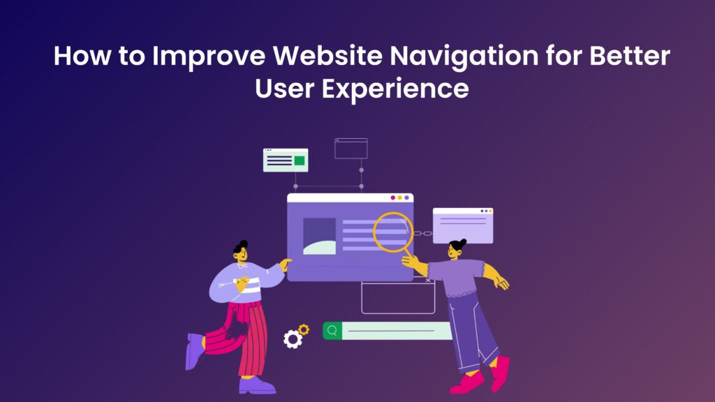
What Is Website Navigation Design? Website navigation is a crucial component of web design that facilitates the movement of users through a website, enabling them to find the information they seek effectively and efficiently. Essentially, navigation serves as the roadmap of a website, guiding users from one section to another while ensuring an intuitive and seamless experience. A well-structured navigation system not only enhances usability but also plays a vital role in user engagement, accessibility, and overall satisfaction. Usability is paramount when considering website navigation. A user-friendly navigation structure allows visitors to easily locate relevant content without confusion or frustration. When users can effortlessly navigate through various sections of a website, they are likely to stay longer and interact more with the content. Conversely, complex or poorly designed navigation can lead to increased bounce rates, where users leave the site quickly due to frustration. Therefore, a clear and concise navigation layout is fundamental in retaining user interest and guiding them toward their desired destinations. Furthermore, accessibility is an essential aspect of website navigation that ensures all users, including those with disabilities, can effectively use the site. Incorporating accessible design practices, such as keyboard navigation options and screen reader compatibility, helps in creating an inclusive environment that welcomes diverse audiences. When navigation is accessible, it widens the potential user base and improves overall engagement metrics. In conclusion, website navigation is more than just a design element; it is an integral part of enhancing the overall user experience. By prioritizing usability and accessibility in the navigation structure, website owners can significantly improve user satisfaction, leading to better engagement and retention. Designs that prioritize effective navigation ultimately foster a stronger connection between the user and the content presented on the site. Understanding User Behavior in Website Navigation Design To create an effective website navigation system, it is imperative to understand user behavior and needs. Users possess certain expectations when they visit a website, which are informed by their prior experiences across various platforms. A well-structured navigation system serves as a roadmap, enabling users to find the information they are seeking quickly and intuitively. This responsiveness to user expectations can significantly enhance their overall experience. Common navigation patterns exhibit a remarkable consistency across different demographics. For instance, many users instinctively seek a top navigation bar or dropdown menus. They appreciate clear labels and recognizable icons that indicate where to click next. Studying these patterns can inform web designers on how to structure their navigation for maximum efficacy. Additionally, understanding that users generally prefer a minimalistic design aids in mitigating cognitive overload, allowing them to make decisions more swiftly. Analyzing user behavior is crucial for tailoring navigation to meet specific needs. Techniques such as user testing, where individuals interact with the website while observers take notes on their actions and reactions, can provide valuable insights. Furthermore, collecting user feedback through surveys or feedback forms can help identify pain points in the navigation process. This data-driven approach enables web developers to refine their navigation systems based on real user experiences rather than assumptions. Engaging with the users directly and observing how they interact fosters a deeper understanding of their needs, leading to a more user-centered design. By integrating user feedback into the design process, web developers can create a navigation experience that not only meets users’ immediate needs but also anticipates their future requirements. Ultimately, a thorough understanding of user behavior not only enhances website navigation but also contributes to an overall optimal user experience. Designing a Clear Navigation Structure Creating a clear and intuitive navigation structure is pivotal in enhancing website usability and user experience. A well-structured navigation system allows users to locate the relevant content efficiently and encourages them to engage more deeply with the website. The first principle of effective navigation design is hierarchical organization. This involves structuring content in a logical manner, where primary categories lead to subcategories, ultimately guiding the user through a streamlined experience. By organizing information hierarchically, users can easily discern relationships among various sections of the site. Another critical element of a successful navigation structure is the categorization of content. It is essential to group related topics together to simplify the browsing process. For instance, an e-commerce website could categorize products into departments such as electronics, clothing, and home goods. Within these categories, further subdivisions can be implemented, such as by brand or price range. This type of layered approach enables users to navigate through the website at their own pace, reducing confusion and enhancing satisfaction. The importance of labels cannot be overstated in this context. Using clear and descriptive labels for navigation items helps users understand what to expect when they click on a link. Ambiguous labels can lead to frustration and increased bounce rates, as users may not find the content they are looking for. Therefore, it is crucial to select labels that accurately reflect their respective categories or pages, ensuring a seamless flow of information. For example, websites like Amazon and Wikipedia illustrate best practices in navigation structure. Amazon utilizes mega menus that display multiple categories simultaneously, making it easier for users to find products. Conversely, Wikipedia employs a set of well-defined categories on its sidebar, allowing users to explore a range of topics effortlessly. By adhering to these principles of navigation structure, web designers can significantly enhance the user experience, leading to greater user satisfaction and retention. Implementing Responsive Navigation for All Devices In today’s digital landscape, responsive design is pivotal for ensuring optimal user experience across various devices. With the increasing prevalence of smartphones, tablets, and other mobile devices, it is essential that website navigation adapts seamlessly to different screen sizes. Users expect a consistent experience whether they are browsing on a desktop, laptop, or mobile device, which makes responsive navigation a critical aspect of web development. Responsive navigation involves the implementation of design techniques that allow navigation menus to rearrange or transform based on the capabilities of the device being used. One widely adopted solution is the hamburger menu, which condenses
Responsive Web Design: Why It Matters for Modern Businesses
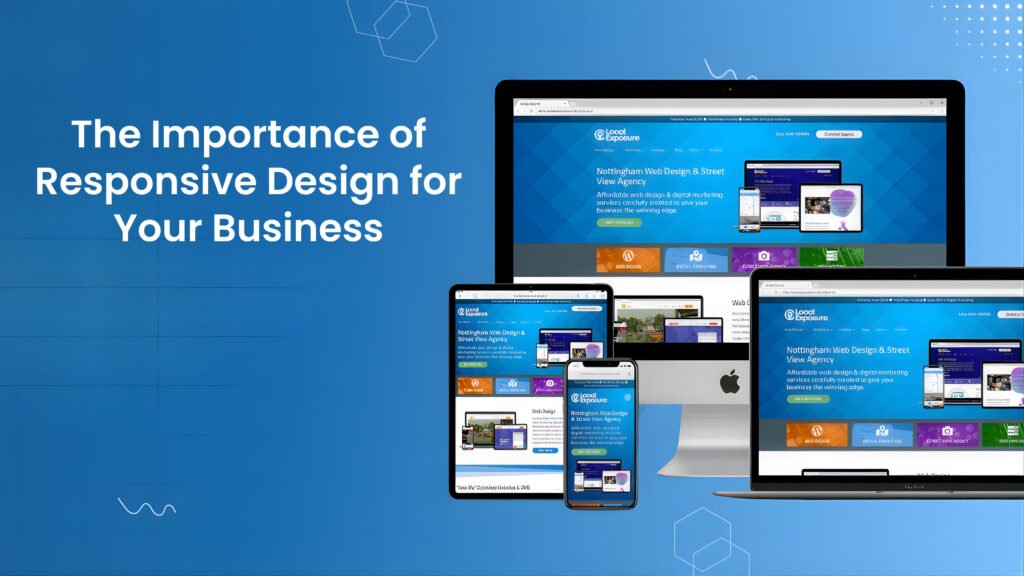
What Is Responsive Web Design? Responsive design is a web development approach that aims to create web pages that provide an optimal viewing experience across a wide range of devices. This includes desktop computers, tablets, smartphones, and even emerging devices like smartwatches. The primary goal of responsive design is to ensure that users can easily navigate and interact with websites regardless of the screen size or orientation. It accomplishes this through several key principles, namely fluid grids, flexible images, and media queries. Fluid grids form the foundation of responsive web design by allowing layout elements to resize and rearrange based on the user’s screen size. Instead of using fixed pixel dimensions, fluid grids utilize relative units like percentages, which allow elements to proportionally scale. This flexibility ensures that a website’s structure remains intact, whether viewed on a large monitor or a small smartphone display. In addition to fluid grids, flexible images play a crucial role in responsive design. This principle involves using images that can scale within the confines of their parent elements, rather than being constrained by fixed dimensions. Techniques such as CSS properties like “max-width: 100%” help images resize appropriately, permitting them to maintain their aspect ratios and preventing distortion on various devices. This approach significantly enhances the user experience by ensuring visual content remains clear and engaging, regardless of the viewing medium. Finally, media queries are essential for applying different styles based on the characteristics of the device being used. These CSS rules allow developers to set specific breakpoints, altering the layout and design according to factors like the viewport size or screen resolution. This versatility is vital in catering to a diverse audience, ensuring that all users receive an equally functional and visually appealing experience. Understanding these principles is crucial for any business aiming to enhance its online presence in today’s mobile-centric world. The Growing Use of Mobile Devices In recent years, the prevalence of mobile devices has dramatically increased, reshaping how consumers interact with the digital world. Smartphones and tablets have become ubiquitous, allowing users to access the internet anytime and anywhere. According to recent statistics, mobile devices account for over half of global web traffic, with that number continually rising as technology advances and mobile connectivity improves. Consumer behavior has shifted significantly towards mobile web browsing. As more individuals rely on their devices for everyday tasks, including shopping, social networking, and information gathering, businesses must recognize this change. Research has indicated that nearly 80% of consumers use their mobile devices to research products before making a purchase, underscoring the importance of having a mobile-friendly website. Additionally, it has been reported that mobile users are more likely to engage with content that is optimized for their devices, leading to higher conversion rates for businesses that prioritize responsive design. Furthermore, the impact of mobile usage extends beyond mere consumption of information. The average user spends close to 3 hours daily on mobile applications, which highlights the significance of creating an accessible and enjoyable browsing experience. Companies that fail to adapt their websites for mobile users risk losing potential customers and harming their overall online presence. An increasing number of web users expect fast-loading, visually appealing sites that function seamlessly across various screen sizes. Therefore, adopting a responsive design approach has become integral to business strategies aiming to capture the mobile market and enhance user experience. In light of these trends, it is clear that businesses must invest in responsive design to meet the needs of their mobile clientele effectively. Ignoring this shift could result in lost opportunities and diminished customer satisfaction. How Responsive Web Design Improves User Experience In the digital landscape, where users access websites through a myriad of devices, from smartphones to tablets and desktops, the importance of responsive design cannot be overstated. Responsive design ensures that a website adapts efficiently to various screen sizes and resolutions, providing users with a seamless experience. This adaptability significantly enhances user experience (UX), addressing the diverse preferences and behaviors of users. A seamless performance across different devices plays a critical role in reducing bounce rates. When users encounter a website that is not optimized for their device, they are likely to leave almost immediately, contributing to increased bounce rates. Conversely, a responsive design ensures that elements are displayed correctly and that navigation is intuitive, keeping users engaged. This engagement is essential, as it can lead to users spending more time on the site, exploring various offerings, and consuming content without frustration. In addition to reducing bounce rates, responsive design fosters higher user engagement. When visitors feel that a website is tailored for their device, they are more likely to interact with its content, whether it’s clicking through pages, signing up for newsletters, or making purchases. This engagement not only creates opportunities to build a relationship with the user but also increases the likelihood of conversion. Responsive websites have been shown to experience higher conversion rates, as users find it easier to complete tasks and navigate through their purchasing journey. Overall, prioritizing responsive design translates to significant benefits, including enhanced user satisfaction and increased likelihood of repeat visits. A well-designed responsive website ultimately serves as a solid foundation for improving user experience, encouraging customer loyalty, and boosting business success. SEO Benefits of Responsive Web Design Responsive design plays a pivotal role in enhancing search engine optimization (SEO) for businesses. With an increasing number of internet users accessing websites through mobile devices, search engines like Google have prioritized mobile-friendly sites in their ranking algorithms. Consequently, websites utilizing responsive design are more likely to achieve higher visibility in search engine results pages (SERPs). This approach allows a single, adaptable website to serve various devices, ensuring a seamless user experience regardless of screen size. One significant advantage of responsive design is the elimination of duplicate content. Traditional mobile sites often consist of separate URLs for desktop and mobile versions, which can lead to fragmentation of traffic and diluted SEO efforts. In contrast, responsive websites employ a single URL that caters
Web Design Trends 2025: Future-Ready Website Design Guide

Introduction to Web Design Trends 2025 Web design is a constantly evolving field that reflects both technological advancements and shifts in user preferences. As we approach 2025, understanding the current trends in web design is crucial for developers, businesses, and marketers alike. These trends not only dictate the aesthetic appeal of a website but also play a significant role in enhancing the user experience. A well-designed website is more than just visually attractive; it must also be user-friendly, facilitating easy navigation and engagement. The importance of keeping up with web design trends cannot be overstated, as they can significantly influence a user’s perception of a brand or service. Websites that adhere to current design principles tend to achieve higher user retention rates, improved search engine rankings, and an overall better interaction with their audience. This is not just about following a trend for aesthetic purposes; it is about creating an environment that responds to user needs and expectations. Moreover, the evolution of technology introduces new tools and methods for web designers to explore. From advancements in artificial intelligence to the growing emphasis on responsive design, these factors contribute to shaping the future landscape of web design. Trends often reflect larger changes within the digital ecosystem, including how users interact with devices, the rise of mobile browsing, and the increasing demand for accessibility. As we prepare to delve into the web design trends anticipated for 2025, it is essential to recognize how past developments have set the stage for current and future innovations. In this blog post, we will explore a range of significant trends that are expected to dominate the web design landscape in 2025. By understanding these trends, stakeholders can make informed decisions about their web design strategies, ensuring they remain competitive in an ever-changing market. Sustainability in Web Design Trends 2025 The emphasis on sustainability in web design is gaining significant traction as environmental consciousness continues to influence various industries. As we advance towards 2025, web designers and developers are increasingly integrating eco-friendly practices into their projects. This shift is not just beneficial for the planet; it resonates with users who prioritize sustainable choices in their digital experiences. By adopting sustainable design principles, web professionals can create a more eco-conscious online presence. One key area where sustainability can be implemented is through energy-efficient hosting solutions. Traditional hosting services often rely on energy-intensive server farms, but choosing green hosting options that utilize renewable energy sources can significantly reduce the carbon footprint of a website. By aligning with providers that invest in sustainable infrastructure, designers not only contribute to a healthier environment but also promote their commitment to eco-friendliness. Another important facet is designing for longevity. Websites are often treated as transient projects, leading to frequent redesigns and updates that contribute to digital waste. By embracing practices such as modular design, designers can create websites that are easy to update and maintain over time, minimizing the need for complete overhauls. This approach not only extends the life cycle of a website but also fosters a more sustainable relationship between users and their online platforms. Lastly, employing sustainable design principles—such as using minimalistic designs, optimizing images, and reducing unnecessary features—can enhance the performance and accessibility of a site while simultaneously being environmentally considerate. By focusing on these practices, designers can ensure that their web projects are aligned with both user needs and environmental stewardship, reflecting a commitment to sustainability in the digital realm. Inclusive and Accessible Web Design Trends 2025 As the digital landscape evolves, inclusive and accessible design has emerged as a fundamental principle that designers must prioritize. The growing awareness of the diverse needs of users mandates a shift towards designing websites that accommodate individuals with disabilities. This progressive approach not only enhances user experience but also aligns with universal design principles that ensure equitable access to information and services for all users. To create an accessible web experience, designers should adhere to established guidelines, such as the Web Content Accessibility Guidelines (WCAG). These guidelines provide a comprehensive framework outlining how to make content more perceivable, operable, and understandable. By implementing features such as alt text for images, keyboard navigation options, and adequate color contrast, web designers can significantly improve accessibility for visually impaired users and those with motor disabilities. Furthermore, incorporating responsive design practices ensures that content is usable across various devices, benefiting a broader section of the population. In addition to catering to users with disabilities, inclusive design acknowledges the variations in user experiences. Factors such as cultural background, language proficiency, and technological literacy can all impact how individuals interact with digital content. Therefore, designers must consider a variety of perspectives throughout the design process. This can be achieved through user testing with diverse groups, gathering feedback, and creating personas that reflect a wide range of user experiences. Ultimately, the focus on inclusive and accessible design reflects a broader cultural shift toward empathy and understanding in the digital era. By prioritizing the needs of all users, web designers contribute to a more equitable internet, where everyone can engage meaningfully with online content. AI-Driven Personalization in Web Design Trends 2025 Artificial Intelligence (AI) has significantly impacted various industries, and web design is no exception. One of the most exciting developments in this domain is AI-driven personalization, which offers designers innovative ways to create tailored experiences for website users. By analyzing data from user interactions, preferences, and behaviors, AI facilitates a more intuitive and responsive design approach, ultimately enhancing user satisfaction and engagement. AI technologies can track user behavior in real-time, allowing websites to adjust content dynamically based on individual preferences. For instance, e-commerce platforms can showcase products that align with a user’s past purchases and browsing habits. Similarly, news websites can modify article recommendations, ensuring that users receive content pertinent to their interests. This level of personalization not only improves user experience but also fosters a deeper connection between the user and the website. Another vital aspect of AI-driven personalization is its capability to optimize layout and